Welcome to Gaia! ::

Reply The Anime Art Academy
Critique welcome

Quick Reply

Enter both words below, separated by a space:

Can't read the text? Click here

Submit

Dark Bunny Lord

PostPosted: Sat Jan 24, 2009 10:55 am
Havn't posted in here in a long long time. Figure it's about time I did some updates on my progression as an artist.

As always custom critique is appreciated to help further my own growing passion to improve myself.

User Image
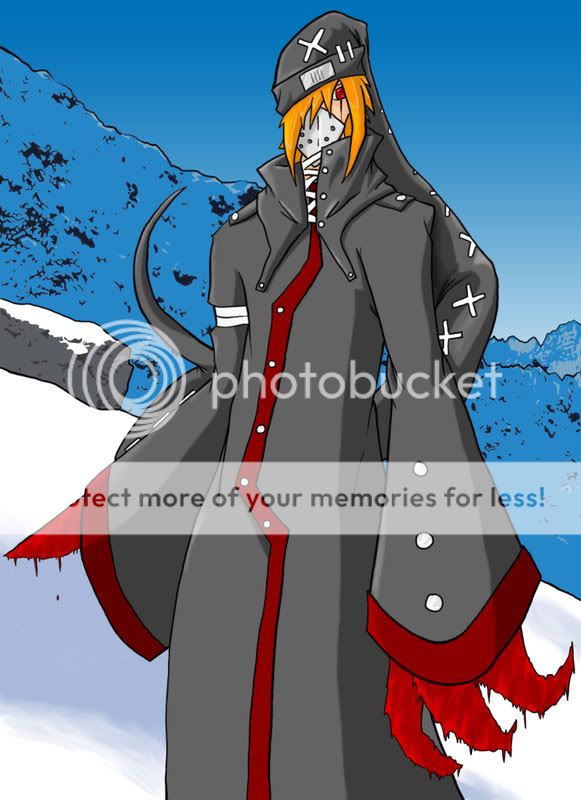
Now this piece was for a game I was trying to get into the closed beta for.
The only thing I noticed glaringly as a mistake after I had submitted it, was the left leg, the knee bends outwards it appears instead of inwards as it's matching leg... woops.

User Image
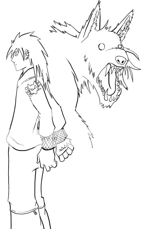
A picture I did for a friends offline, paper pencil role-play character. Decided to try and play with an awkward angle since I never do profile side views normally, still need heavy practice in the area. The only real issue I had with this one at the end was I didnt' care for the characters face shape, just bothered me, and I forgot to do the gumline for the were wolfs lower jaw in the background.

User Image
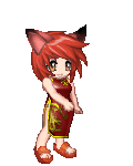
I tried something different here. Normally I try to just use flat colors with line work and kind of lazy shading, so I wanted to try and go for a "no line" look.
Deffinately wasn't great, but it's a unique piece in my collection that I had fun doing in the fact that it keeps a sense of simplicity.

User Image
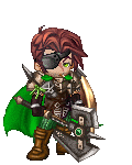
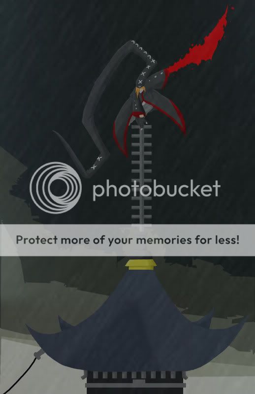
My character in a popular guild RP I run. This was my first time doing a background. I really wish I had done some heavier shading, and the light source is a bit off, but other than that I'm happy with the way it turned out.

User Image
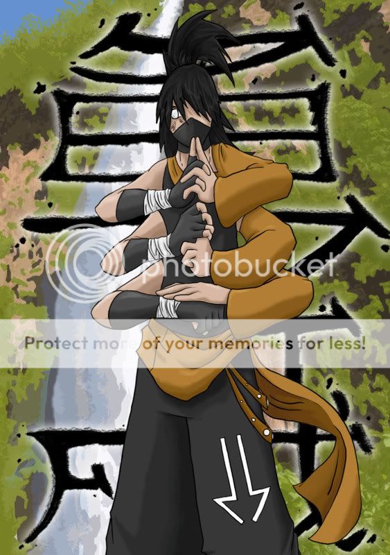
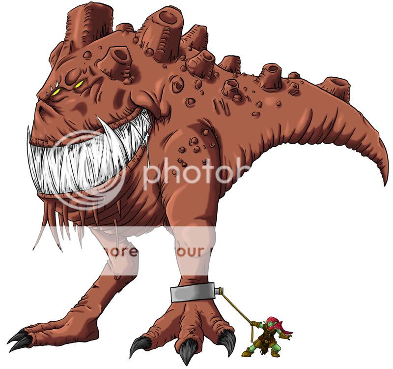
My second actual paid (money) commission and my second time trying to do a background which I almost liked more than the character... alas it doesn't exactly match the same "cleaner" type of art style as the character retains, but for a still image in a non-comicy type format I liked it non the less and the customer was satisfied.

User Image
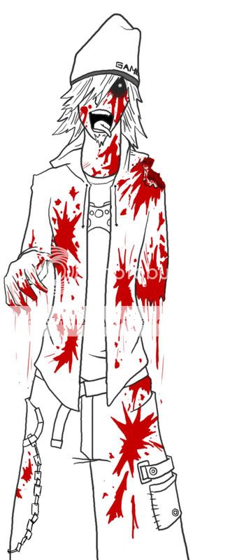
And lastly myself as a zombie, just something I did for fun around halloween for my DA account.
I really should go back and color it some time but meh, working on my 3d modeling for the time being.  
PostPosted: Tue Apr 14, 2009 12:24 pm
1st pic: adding a texture could make the monster's skin look better. and if u want to sitck to the cell-shade-look, darker shading can help the image pop out more. the teeth area that's closer to his cheeks should have some shading. t
the gnome looks so funny trying to handle that big fella =D
2nd pic: were u going for a shocked look for the wolf?
its left eye(viewer's right) is too small.
zombie pic: hear have some tissues! *hands over boxes of tissues* xP
nice job on them! keep it up~~  

miharu_hime


VonLied

4,250 Points
  • Signature Look 250
  • Invisibility 100
  • Peoplewatcher 100
PostPosted: Wed Jul 15, 2009 3:07 pm

1st Piece:
LMFAO! Love the little guy holding him back! The beast it self is fantastic. I agree with Miharu, a texture could make the skin look a little better. Also the shackle on the leg... comes off a little flat and needs some volume.

2nd Piece:
I'm starting to get the feeling that beasts are your strong point. I would like to see this in color or at least shaded.

3rd Piece:
It's very flat. VERY flat. It's good to experiment, and this one seems like a great first try

4th Piece:
Background needs some work, and i would suggest adding another darker shade in the coat.

5th & 6th Pieces:
Awesome, love em, no critique here!


User Image
 
PostPosted: Tue Jan 03, 2012 10:52 pm
i like all of them overall. i think you should add thinner lines, it will add detail and depth to your art. 3nodding  

bakedkitten

Demonic Noob

Reply
The Anime Art Academy

 
Manage Your Items
Other Stuff
Get GCash
Offers
Get Items
More Items
Where Everyone Hangs Out
Other Community Areas
Virtual Spaces
Fun Stuff
Gaia's Games
Mini-Games
Play with GCash
Play with Platinum