Welcome to Gaia! ::

Drawing a Day Guild! Improve Your Drawing!

Back to Guilds


Reply Drawing a Day Guild
Critique Thread! Goto Page: [] [<] 1 2 3 ... 4 5 ... 10 11 12 13 [>] [>>] [»|]

Quick Reply

Enter both words below, separated by a space:

Can't read the text? Click here

Submit

Kangaroo S.T.U.
Vice Captain

PostPosted: Mon Jun 04, 2007 11:12 pm


XDD sweet pic

though it looks like lisa is gonna eat the snowman's arm

@Kiyo: Totally! the muzzle is like giving me hell lol
PostPosted: Tue Jun 05, 2007 1:22 pm


cool nice dogy

Do you like these?

User Image

User Image

User Image

Please critiqe  

InfinityDude


d34thk1tty

PostPosted: Wed Jun 06, 2007 5:39 pm


i think you have a very good eye for color and shape, but then again i have no clue what i am talking about sweatdrop it looks good though
PostPosted: Thu Jun 07, 2007 7:58 pm


well, here's one i've been wanting people to critic for me. what do you guys think?
User Image

Mystic Sky


Mystic Sky

PostPosted: Thu Jun 07, 2007 8:01 pm


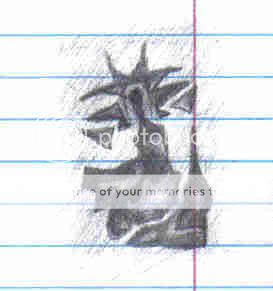
oh yeah, i forgot about this one. its really wierd, and i dont even know what it is even though i drew it. tell me your opinion on it. its one of my wierd doodles.
User Image
PostPosted: Sat Jun 09, 2007 1:37 am


The weird doodle looks like the start of possible some shape exersices with silhouette.

It's where you blob down black and make shapes and what not for a character and try to make the shadow look really interesting. From there you fill in details inside the shadow with grey and white.

http://jeffsfolio.com/pw.php

Here's my teacher's website. On this page you'll see a guy in black and white on the right. First the shadow of the character was made, then the details were put in. same for the guns. He gave them interesting shadows (sihouettes) then he cut away details.

I'm not sure what your doodle is but you can try this exercise if you'd like with the shadows.

----

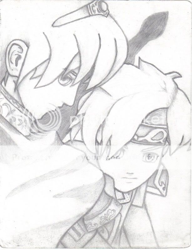
Marth and Roy.

Roy looks okay. The little bit of shading keeps his hair from being too flat. THe character is fairly on model too. I think pushing some more contrast (light areas vs dark areas, not to be confused with black and white) in the shading will help pop out the characters. Marth isn't looking as hot as Roy is.

I think it's that sword shadow. It's rather out of place. ALso it points off the picture plane. razz

A suggestion would be to get rid of the sword shadow.

I think Marth's just looking really flat from the lack of contrast on his face compared to Roy.

Good job on these pics though. You've got a basic understanding of some of the fundamentals. 3nodding not to crit your other pics

Kangaroo S.T.U.
Vice Captain


Kangaroo S.T.U.
Vice Captain

PostPosted: Sat Jun 09, 2007 1:44 am


@ InfinityDude

I like the first and last picture.

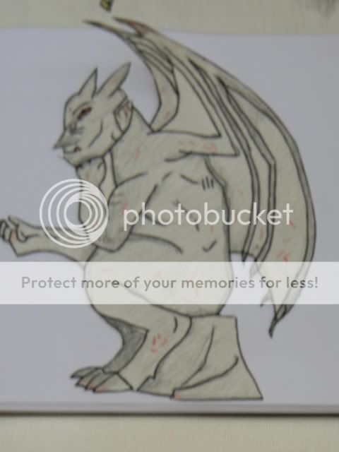
The first one has a gist of some basic anatomy in there. I advise checking out some winged creature reference and seeing how the wings attatch to the back for a little more realistic approach to the sockets in which the wings fit.

Also if this creature were to fly the sockets would be on the shoulder blades farther back. You probably won't see it actually connected to the back from that angle, but it will be implied. 3nodding

For the second picture

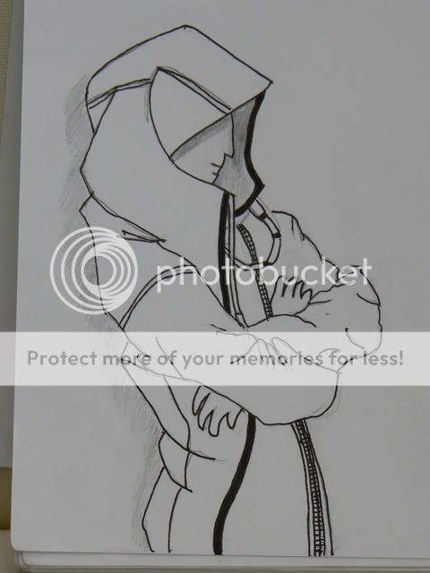
remember that even if people are wearing clothes they are still people underneath. To help this pic feel less flat and to give it more depth, sketch out the skeleton of the person or some basic shapes for their mass before putting the cloak on first. It'll help a lot. I see some bend in the spine, that's great!

Most peple draw characters stiff as a board but this is a very nice start. Posture postsure. Line of action.

Here's what line of action is.

biggrin keep it up

http://www.animationarchive.org/pics/pbanimation07-big.jpg

For the third

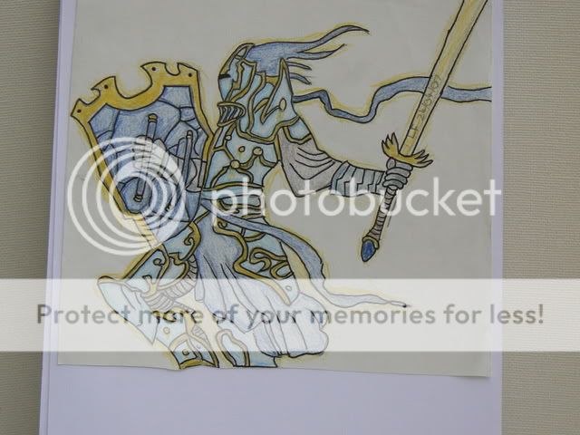
I think this one is one of your strongest, not becuase of the color either. There's a more solid feel to the form, it's not nearly as flat like the first and second drawing. It's still flat but not so much. The pose is nice too. Lost of movement.

Try to show the shape of the armour by having the details curve around the shapes in the armour. If they are drawn flat on they'll flatten out the picture.


It looks like you're doing very well

You guys, keep drawing and advancing! You'll be churning out some really awesome art someday
PostPosted: Thu Jun 14, 2007 8:09 am


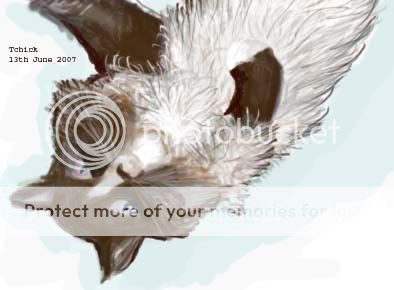
I finally decided to post this here considering that Kangarro has been hinting at it for some time. xD

Either you're eager to tell me how bad it is, or just ready to critique more people, either way, here you are. 4laugh

User Image

Tchick


Kangaroo S.T.U.
Vice Captain

PostPosted: Sat Jun 16, 2007 7:43 am


XD no no it's not bad at all!

I just noticed that the folks here in general say stuff like "yeah this part of the drawing kinda looks bad" or "I know I can't draw such and such but I tried to anyway"

I figured if you're having difficulty doing a certain part there's a perfect chance to get some pointers to help out so you can get better faster 3nodding

OD, if you see this post before I see you today, post that link to Conceptart.org with that guy who started as an art newbie!

There's this really inspiring thread where a guy who's brand new to art becomes very very good by asking for critique and trying to draw everyday, much like we are 3nodding

You said this was done in photoshop yes? It's good 3nodding

One thing that'd make your kitty drawings better over time is if you use shapes to help give the cat depth and mass. 3nodding An example would be the paw. It looks flat from the way it's colored, but if you think of it as a cylinder rather than just a flat surface, it might help it look more 3D.

Also the greenish stuff around the cat was a good idea biggrin It helps the viewer focus on the cat with all the white space in the image as well as the white from the forums here. 3nodding good choice. Nice color too! It doesn't overpower the colors on the cat.

You're doing really well so far

Totally keep posting here and in the drawing a day thready thing 3nodding It'll be cool to see your progress over time
PostPosted: Sat Jun 16, 2007 10:13 am


Thanks very much for that. That makes me feel better.

Now you mention it, yes that paw does look a bit flat, I'll keep an eye on my 3-dness next time. It could have done with a bit more of a curved look because I don't think my kitty really does have a flat paw o.O; xDD

Okay, I'll be sure to post a lineart of something here next -- I'm sure there's something I'm not doing, some tool or method that I don't know about or something.

Yeah, I learnt in art class that if you give your pictures a background, 9 times out of ten it'll make it look better, can give it a more balanced feel and draw the viewers eye in. I'd reccommend it for other people to use, just try not to choose a background that's too overpowering. Blue and pale greys are quite recessive colours, it makes things look distant, these are often good colours to use if you just want a quick background. Though I wouldn't reccommend it if you have a lot of blue and grey in your picture already - that can throw the picture out of balance.

I shall continue to post things here so you can help me out more. ^^; Thanks a bunch Kanga.

Tchick


Kangaroo S.T.U.
Vice Captain

PostPosted: Sun Jun 17, 2007 9:00 am


XD a GOOD background can help


3nodding yes no overpowering backgrounds and colors are important if there's color. whee you've got some art knowledge there

biggrin warm colors such as red yellows and oranges tend to pop out into the foreground, and neutral colors like green like to sit in the middle, and blues and grays like to sit in the background.

It's that way our eyes and brains work surprised
of course one can experiment with the colors and find other ways of making them work, but for now I'm going to try to stick with this basic rule till I get a good hang of it. 3nodding
PostPosted: Sun Jun 17, 2007 9:30 am


User Image

You guys can critique this as well. It's a color composition. Basically blocked in colors and basic shapes from the lineart that will show what base colors will be use in the picture.

Not the best example of colors, however, notice your eye first sees the red and yellow orange tower. It's a warm color while everything else is a cool color or a neutral green. The warm colors jump out at your eye first in terms of color temperature.

lol it doesn't help it's in the middle of the composition as well. X3;;;

but that's another story

Kangaroo S.T.U.
Vice Captain


rock_star2011

PostPosted: Sun Jun 17, 2007 6:27 pm


Critique these for me....
User Image
User Image
User Image
User Image
PostPosted: Sun Jun 17, 2007 7:51 pm


Was there anything in particular you wanted me to critique on, or did you want me to just crit in general?

Kangaroo S.T.U.
Vice Captain


Kangaroo S.T.U.
Vice Captain

PostPosted: Tue Jun 19, 2007 9:15 am


User Image

just a doodle biggrin crit please
Reply
Drawing a Day Guild

Goto Page: [] [<] 1 2 3 ... 4 5 ... 10 11 12 13 [>] [>>] [»|]
 
Manage Your Items
Other Stuff
Get GCash
Offers
Get Items
More Items
Where Everyone Hangs Out
Other Community Areas
Virtual Spaces
Fun Stuff
Gaia's Games
Mini-Games
Play with GCash
Play with Platinum