|
|
|
|
|

Kangaroo S.T.U. Vice Captain
|
 Posted: Mon Aug 06, 2007 10:52 am Posted: Mon Aug 06, 2007 10:52 am
Origamidude Bassken Lake Monster > 3> Origami's a skinny skinny person domokun I am envious! ? XD why did you quote my whole post?! I was confused [Shimizu-chan]: I took it down because it's being used by someone I don't want it to be used by. As far as I'm concerned unless they comply with my wishes I'm never going to post this image on gaia again. X3;;;
|
 |
 |
|
|
|
|
|
|
|
|
|
|
|
|
 Posted: Fri Aug 10, 2007 2:22 pm Posted: Fri Aug 10, 2007 2:22 pm
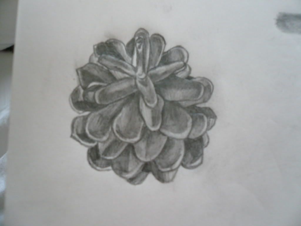
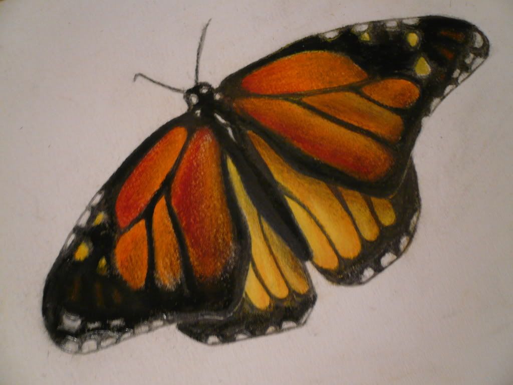
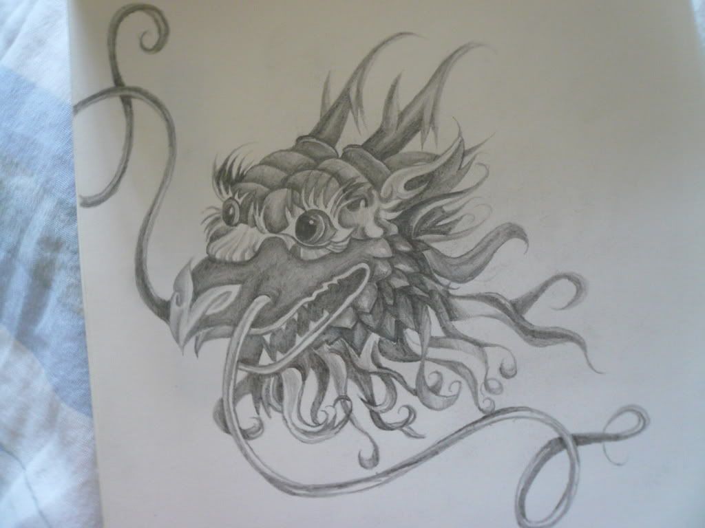
Today, yesterday and the day before yesterday: Time: Aprox. 30 min. Medium: Pencil, HB and 2B.  Time: Aprox. 1 hour. Medium: Pastels and Charcoal.  Time: Aprox. 30 min. Medium: Pencil, 4B and B.  What do you guys think? Anything seem off? I need the crits, honestly. People tend to just tell me I'm a good artist and then run off. So?
|
 |
 |
|
|
|
|
|
|
|
|
|
|
|
|
|
|
|
 Posted: Fri Aug 10, 2007 4:23 pm Posted: Fri Aug 10, 2007 4:23 pm
@ mystifyingbliss:
I like your pencil shading, I'd recommend getting a softer pencil too, and add some really dark areas in and go back and add some really light areas with your eraser. Grab the 8B pencil and get some deep color in there. Having bold areas make the drawing more interesting to look at, rather then just an all gray area.
For the pastel and charcoal, I thought it was colored pencils until I read that it wasn't. XD!
Lovely colored shading on it. For the bug itself and not the wings, is there more detail that I can't see because of the photo? That area looks a little dull to me, but I love the colors on the wings.
What brand of pastels and charcoal do you use?
If you don't use Prismacolor, check out their chalk pastels and their charcoal.
|
 |
 |
|
|
|
|
|
|
|
|
|
|
|
|
 Posted: Sat Aug 11, 2007 10:06 am Posted: Sat Aug 11, 2007 10:06 am
@mystifyingbliss;; Wow! Those are stunning! Especially the butterfly! You colored it and shaded it very well!!
I can't recommend anything for your pastel...
If anything, I'd use a softer led, and something to smudge and blend to give it a softer feel.
But full-pencil pieces aren't my area of expertise...so I dunno how much help I will be! ^o^;
And thanks everyone who critiqued me before. :3
I have another piece~
Could someone critique me?
|
 |
 |
|
|
|
|
|
|
|
|
|
|
|
|
|

Bassken Lake Monster Vice Captain
|
 Posted: Sat Aug 11, 2007 2:38 pm Posted: Sat Aug 11, 2007 2:38 pm
mystifyingbliss:
o.o ooh but you art a good artist!
I agree with Kiyo on the pencil drawings. 3nodding more contrast! It'll really make those images pop right off the page with some more darker areas to contrast with the white highlights.
The butterfly is lovely heart 3nodding did you use reference? It looks like you did. I don't know much about pastel myself so I couldn't give tips on any pastel related stuffs.
I've got a question about the dragon. One eye looks like it's on the front of the face while the other looks like it's on the side. I suppose either bring the eye on the right closer to the front of the face or bring the eye on the left back and around the face so it's at about the same place as the other.
3nodding I think the dragon can use some more contrast too.
|
 |
 |
|
|
|
|
|
|
|
|
|
|
|
|
 Posted: Sat Aug 11, 2007 2:53 pm Posted: Sat Aug 11, 2007 2:53 pm
Da-Eh:
3nodding nice nice XD the Richu is a cutie
With the arms watch the length. Both of them are different. The arm holding up the character is shorter than the one that's on her knee.
The character silhouette is pretty good 3nodding if the girl was filled in with a solid color you could still tell that she's sitting down and relaxing. biggrin nice
On the Richu, the top of the foot on the left ends where the line for the hand mittens begins. It reads strangly, as if the brown part would possibly be part of the hand rather than the foot. o.o possibly tilting the foot farther or maybe moving the hand to another position so the top of the foot and the brown part of the hand don't share the same line will make it less confusing.
For the coloring I think the shading can be darker. Don't be afraid to add some really dark shadows where it's appropriate 3nodding If you want to get into painting digitally biggrin don't shade with black. Using other colors to show warm and cool lighting and shadow and highlight will give your pictures much depth 3nodding
|
 |
 |
|
|
|

Bassken Lake Monster Vice Captain
|
|
|
|
|
|
|
|
|
|
|
|
 Posted: Fri Aug 17, 2007 6:58 pm Posted: Fri Aug 17, 2007 6:58 pm
 my style on paint some how got to a think sketchy feeling... but yeah what are some things i can do to improve
|
 |
 |
|
|
|
|
|
|
|
|
|
|
|
|
 Posted: Fri Aug 17, 2007 11:39 pm Posted: Fri Aug 17, 2007 11:39 pm
3nodding good to see you posting here!
biggrin do you use a mouse with paint?
Let's see I think the thing that'll help you the most right now would be some structure with the character's body. surprised try to break down the body parts as 3D shapes in your mind and build the character off of that. :3 it'll help give your avi arts some more volume and depth.
Like the legs, where you put the darker colored shading. biggrin if you think of the legs as similar to cylinders you couldu put the shading in a spot that'll help the legs look more 3D rather than very flat 2D 3nodding like in the avatar pic on the right and in the face that you colored biggrin
Don't be afraid to draw something that isn't directly from the avatar. 3nodding
|
 |
 |
|
|
|

Kangaroo S.T.U. Vice Captain
|
|
|
|
|
|
|
|
|
|
|
|
 Posted: Sat Aug 18, 2007 9:26 am Posted: Sat Aug 18, 2007 9:26 am
Kangaroo S.T.U. 3nodding good to see you posting here! biggrin do you use a mouse with paint? Let's see I think the thing that'll help you the most right now would be some structure with the character's body. surprised try to break down the body parts as 3D shapes in your mind and build the character off of that. :3 it'll help give your avi arts some more volume and depth. Like the legs, where you put the darker colored shading. biggrin if you think of the legs as similar to cylinders you couldu put the shading in a spot that'll help the legs look more 3D rather than very flat 2D 3nodding like in the avatar pic on the right and in the face that you colored biggrin Don't be afraid to draw something that isn't directly from the avatar. 3nodding heh thnx... i was just tryin to practice with shading but yeah.. and i have a tablet so i use that and got so used to it... i cant draw with the mouse like i used to even though that wasnt that good either sweatdrop
|
 |
 |
|
|
|
|
|
|
|
|
|
|
|
|
 Posted: Sun Aug 19, 2007 9:24 am Posted: Sun Aug 19, 2007 9:24 am
o.o tablets are so much fun!
Duuude totally keep posting here. I see you've got things rather close to the avatar so it'd gonna be neat seeing your renditions of them as you grow and change as an artist 3nodding
XD you guys keep posting even if it's not every day <3 I love coming here and seeing new stuff! Don't ever feel intimidated. Everyone's here for improvement.
|
 |
 |
|
|
|

Kangaroo S.T.U. Vice Captain
|
|
|
|
|
|
|
|
|
|
|
|
 Posted: Mon Aug 20, 2007 1:34 pm Posted: Mon Aug 20, 2007 1:34 pm
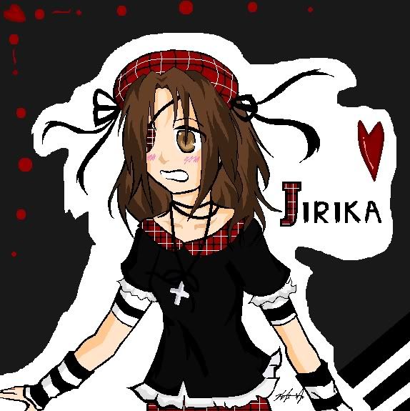
 This was a Oc drawing I drew for my friend, Jirika. I drew this on Ms Paint with a mouse (not a tablet...I wish I had one, though...xD) This probably took about....60-90 minutes. surprised
|
 |
 |
|
|
|
|
|
|
|
|
|
|
|
|
 Posted: Tue Aug 21, 2007 7:27 am Posted: Tue Aug 21, 2007 7:27 am
X3 I think one issue here is the lighting. biggrin the character is differently in a few places. Both arms are lit differently, as well as the face.
The BG is cute and interesting. I can see why you put the white around the character. XD with all that black on you really wouldn't be able to see it otherwise.
For the lighting, even if the light source is coming from let's say, the right, the arm on th left would be mostly in shadow because the body would block all the light. Unless the arm on the left is on front of the body, which is hard to tell with all the black clothing. X3;;;
|
 |
 |
|
|
|

Kangaroo S.T.U. Vice Captain
|
|
|
|
|
|
|
|
|
|
|
|
 Posted: Wed Aug 22, 2007 11:43 am Posted: Wed Aug 22, 2007 11:43 am
Darn teh lighting! >w<
I'll work on that...usually it can be a little confusing...^^
Thanks for teh critique!
|
 |
 |
|
|
|
|
|
|
|
|
|
|
|
|
 Posted: Wed Aug 22, 2007 6:40 pm Posted: Wed Aug 22, 2007 6:40 pm
 heh i wanna shade this picture.... but not exactly sure where to put the shadeing... help?? and just over all critique too surprised
|
 |
 |
|
|
|
|
|
|
|
|
|
|
|
|
|

Bassken Lake Monster Vice Captain
|
 Posted: Wed Aug 22, 2007 9:27 pm Posted: Wed Aug 22, 2007 9:27 pm
It depends where you want to put the light source. Wherever that may be remember:
Think of the character as if they were 3D. Shade the character as if the light was bouncing off of a 3D surface. For example, the torso is very cylindrical. So where the light scource is coming from, the light will react with the torso like a cylinder. The head would probably be best described as a sphere, and the arms and legs would be cylindrical too.
|
 |
 |
|
|
|
|
|
|
|
|
 |
|
|


