|
|
|
|
|
|
|

Kangaroo S.T.U. Vice Captain
|
 Posted: Wed Sep 05, 2007 9:57 am Posted: Wed Sep 05, 2007 9:57 am
TootsieFruity http://img479.imageshack.us/img479/9346/commishion2pd7.png How can I improve my coloriing? :< Very cute pic btw! heart The whole shapes thing goes for coloring too. Keep the shadows and highlights in places where light would be hidden from, or shine on the object if it were in 3D. As far as coloring technique, I think what you're doing is great. Possibly desaturating that green in the coat and the hair might help unify the colors more so they don't stand out too much. 3nodding it's look'n good
|
 |
 |
|
|
|
|
|
|
|
|
|
|
|
|
 Posted: Wed Sep 05, 2007 10:05 am Posted: Wed Sep 05, 2007 10:05 am
mystifyingbliss http://i189.photobucket.com/albums/z204/mystifyingbliss/Afbeelding135.jpg What do you guys think? Is there anything I have to watch out for or that I can do to improve my eyes, apart from practicing? Got any pointers? I think your eyes are great :3 I didn't really see much I could say about it myself so I visited a tutorial on how to paint eyes http://www.furiae.com/index.php?view=galleryI think you can use some of these tips for shading the eye in black and white and not just color. D: let me know if it helped at all I might add the site to the links list if it was helpful biggrin
|
 |
 |
|
|
|

Kangaroo S.T.U. Vice Captain
|
|
|
|
|
|
|
|
|
|

Kangaroo S.T.U. Vice Captain
|
 Posted: Wed Sep 05, 2007 10:06 am Posted: Wed Sep 05, 2007 10:06 am
|
|
|
|
|
|
|
|
|
|
 Posted: Mon Sep 10, 2007 2:45 pm Posted: Mon Sep 10, 2007 2:45 pm
This world has been connected. Tied to the darkness... Soon to be completely eclipsed.
http://manphish.deviantart.com/art/4-heads-are-better-than-1-64413284
Just tell me what you think. I'm not very good at drawing bodies. So I just did heads.
There is so very much to learn. You understand so little.
|
 |
 |
|
|
|
|
|
|
|
|
|
|
|
|
|

Bassken Lake Monster Vice Captain
|
 Posted: Mon Sep 10, 2007 6:40 pm Posted: Mon Sep 10, 2007 6:40 pm
Manphish This world has been connected. Tied to the darkness... Soon to be completely eclipsed. http://manphish.deviantart.com/art/4-heads-are-better-than-1-64413284
Just tell me what you think. I'm not very good at drawing bodies. So I just did heads.
There is so very much to learn. You understand so little. :3 don't ignore the bodies though you're only as strong as your weakest link! So if it's bodies you're bad at, practice those often!! We're all here to help you learn how to draw the things you're not so sure about. 3nodding This book?  Be careful. It's very stylized. I think going straight for style will hinder your progress. The person who did this book already has an established knowledge of 3D shapes and forms. From this they can measure where the other parts of the face, like the eyes and nose, will be even if the form is being turned. If you worked more on drawing heads with 3D in mind it'll help your pictures come out more full than flat. They're pretty flat right now. By flat I mean it looks like the face is all one plane rather than a three dimensional surface. Even manga and anime today have images that are simple versions of 3D or give the illusion of three dimensions despite that it's all 2D artwork. A good tip is to just study human heads. Get a magazine or a book with loads of pictures of human faces and just draw them. This experience will help you greatly! Things might not come out like you'd like them at first, but keep going. Take notes about how far the eyes are apart, where the face curves and juts out because of bones under the skin and such. If you'd like I can find a tutorial about drawing heads. I know you're probably really digg'n this style, but it'll be much easier if you learn how to generally do a real human head first before doing cartoon/anime/manga type heads. :3 No need to lock yourself in a room for days and draw only human heads XD;;; just a little practice here and there will help your already established skills in drawing faces. For anyone who's not sure what the definition of form is... Form: The shape and structure of an object. (http://www.thefreedictionary.com/form)
|
 |
 |
|
|
|
|
|
|
|
|
|
|
|
|
 Posted: Mon Sep 10, 2007 6:47 pm Posted: Mon Sep 10, 2007 6:47 pm
OH YEAH!
Hey guys
XD;;; don't let me be the only one to critique!!! This thread is for everyone. Learning to critique helps along the learning process. That's right, critiqueing helps you learn to draw.
Why? Because you can pick up on irregularities in a drawing, such as errors in perspective or color issues or something like that. Then when you go to draw, you'll remember those critiques you've made and given so all your pictures will come out better.
Critique on more than one picture. It doesn't have to be one crit for one pic. Don't be afraid!!! <3
You can't learn as quickly if you don't also participate. :3 don't worry about "being wrong."
It's all about learning. Who knows, maybe you're actually right! biggrin wo n't know if you don't try. D: I'm a student myself and I'm trying to learn by putting everything I've been taught (that I can remember) to practice.
:3 guys, help me help you!
biggrin start critiquing! Post more! POST MORE!!!!
I love seeing new posts from you guys 3nodding
|
 |
 |
|
|
|

Bassken Lake Monster Vice Captain
|
|
|
|
|
|
|
|
|
|
|
|
 Posted: Mon Sep 10, 2007 7:41 pm Posted: Mon Sep 10, 2007 7:41 pm
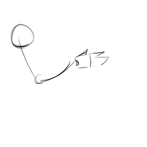
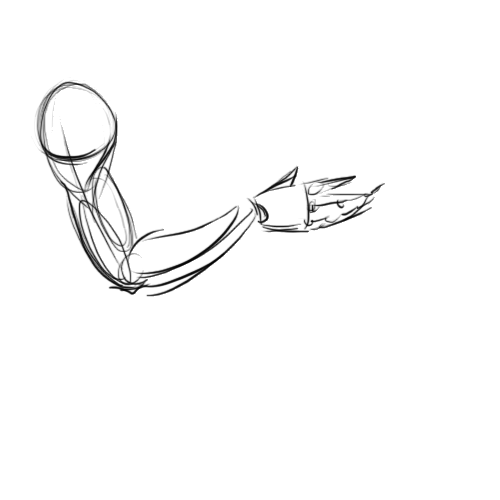
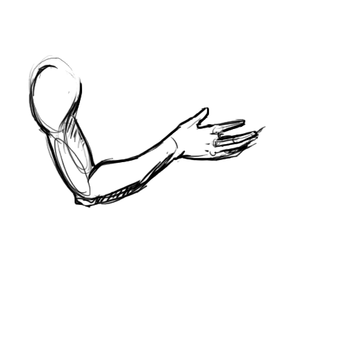
Kangaroo S.T.U. [Shimizu-chan] http://peach-muffinz.deviantart.com/art/NaruSaku-Being-Near-You-63792851 Critique? :33333 Let's see I see you've got some overlapping and shading going on to create depth 3nodding Remember the underlying shapes when drawing. It'll really help your 2D images look and feel more solid and three dimentional For example:    After laying down the construction lines, putting in the basic shapes will help flesh out everything. These shapes will help us get a more 3D feeling when we start to draw the characters. This'll help unflatten the characters in the scene. Good job with the overlapping at the joints of the arms and legs. Naruto and Sakura are wearing clothes that cover most of their bodies, but even then, the clothes react to the shapes of their bodies. 3nodding so by keeping in mind all these shapes it'll help the clothing fall and fit around the forms better. I see you've got the clothes reacting to the shapes underneith in some areas already so you've got the idea. 3nodding Oh, there are a couple of things that can help you out with critiquing. X3; Well, you didn't quite specify what exactly in her picture could be changed. It'd help if you did. X3; I can see where you were going with the examples, but if where to elaborate more to connect the two together, it'd form a better understanding. 3nodding Other than that, strong critique ;3 <3
|
 |
 |
|
|
|
|
|
|
|
|
|
|
|
|
 Posted: Tue Sep 11, 2007 9:01 am Posted: Tue Sep 11, 2007 9:01 am
|

Bassken Lake Monster Vice Captain
|
|
|
|
|
|
|
|
|
|
|
|
 Posted: Tue Sep 11, 2007 1:56 pm Posted: Tue Sep 11, 2007 1:56 pm
This world has been connected. Tied to the darkness... Soon to be completely eclipsed.
Hey Bassken, thanks for the help. I'm not totally into that style, but it's currently the only thing I know how to draw mrgreen . And yes, that's the book I have. A few of my friends also say that it's not the best book to use, so I'll take that advice. Thanks.
There is so very much to learn. You understand so little.
|
 |
 |
|
|
|
|
|
|
|
|
|
|
|
|
 Posted: Tue Sep 11, 2007 8:52 pm Posted: Tue Sep 11, 2007 8:52 pm
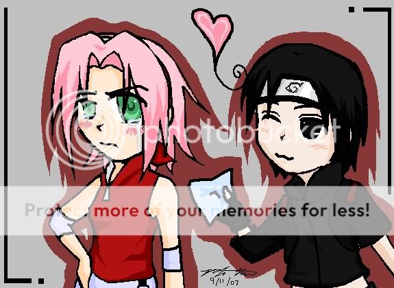
Thank you so much for the critique, Kangaroo! :3 Oh, and another thing to be critiqued...>w<  ((It's a chibi, just in case for the people that didn't nkow...>w<))
|
 |
 |
|
|
|
|
|
|
|
|
|
|
|
|
|

Bassken Lake Monster Vice Captain
|
 Posted: Tue Sep 11, 2007 9:06 pm Posted: Tue Sep 11, 2007 9:06 pm
Manphish This world has been connected. Tied to the darkness... Soon to be completely eclipsed. Hey Bassken, thanks for the help. I'm not totally into that style, but it's currently the only thing I know how to draw mrgreen . And yes, that's the book I have. A few of my friends also say that it's not the best book to use, so I'll take that advice. Thanks.
There is so very much to learn. You understand so little. X3 glad I was helpful gonk sometimes I"m not sure if I am at all :3 I can't wait to see what you upload next you're on the right track
|
 |
 |
|
|
|
|
|
|
|
|
|
|
|
|
 Posted: Tue Sep 18, 2007 5:42 pm Posted: Tue Sep 18, 2007 5:42 pm
The process of encoding hearts is incalculable. The inhabitants of my Twilight Town were data created from real hearts. I was convinced that they would think and behave the way I had envisioned - -but I couldn't have been more wrong. A heart is so much more than any system. I saw it when Roxas and Kairi crossed paths. I knew.

Well, here's my latest upload. the Pen job on it is horrible, but I tried.But I was too stubborn to accept it. It's always the same. I try to wrap my mind around things my heart already knows, only to fail. While I was trying to bring Sora back, I had so many plans in store. But once Sora was an acting force, they fell apart. All my research amounted to nothing, compared with that one boy's heart.
|
 |
 |
|
|
|
|
|
|
|
|
|
|
|
|
|

Kangaroo S.T.U. Vice Captain
|
 Posted: Wed Sep 19, 2007 4:35 pm Posted: Wed Sep 19, 2007 4:35 pm
[Shimizu-chan] Thank you so much for the critique, Kangaroo! :3 Oh, and another thing to be critiqued...>w<  ((It's a chibi, just in case for the people that didn't nkow...>w<)) Chibi chibi! biggrin mind the lenght of the arms there. The ninja on the right has a very very short lower arm than Sakura. On Sakura's face the eye on the right is far larger than the one on the left. If iit's for perspective the eye on the right needs to be a bit smaller still. biggrin just watch out for proportion and you'll do fine.
|
 |
 |
|
|
|
|
|
|
|
|
|
|
|
|
 Posted: Wed Sep 19, 2007 4:38 pm Posted: Wed Sep 19, 2007 4:38 pm
Manphish The process of encoding hearts is incalculable. The inhabitants of my Twilight Town were data created from real hearts. I was convinced that they would think and behave the way I had envisioned - -but I couldn't have been more wrong. A heart is so much more than any system. I saw it when Roxas and Kairi crossed paths. I knew.

Well, here's my latest upload. the Pen job on it is horrible, but I tried.But I was too stubborn to accept it. It's always the same. I try to wrap my mind around things my heart already knows, only to fail. While I was trying to bring Sora back, I had so many plans in store. But once Sora was an acting force, they fell apart. All my research amounted to nothing, compared with that one boy's heart. when drawing the head, remember that there' a skull under all that hair still. X3 The hair is draw rather close to his face so it looks like his skull is smaller than it really is in the very back. The top is okay but the back is a bit too far. biggrin put more space between the hair line near the ears and back of the head to give 'em more skull room. 3nodding Keep posting you're doing nicely
|
 |
 |
|
|
|

Kangaroo S.T.U. Vice Captain
|
|
|
|
|
|
|
|
|
|
|
|
 Posted: Fri Sep 21, 2007 9:16 pm Posted: Fri Sep 21, 2007 9:16 pm
@ Manphish:
Try working on your proportions a bit more. :]]
The eyes look kind of too close together -- try measuring the distance between them and stuff...
Yeah, sounds boring, doesn't it? D';
But you'll get the hang of it soon. :3
And also, the neck is too skinny...>.<
Just thicken it, and voila!
And also for what Kangaroo S.T.U commented on the drawing, keep that in mind as well.
^.^
|
 |
 |
|
|
|
|
|
|
|
|
 |
|
|
|
|
|
|


