|
|
|
|
|
|
|
 Posted: Tue Jan 08, 2008 7:24 pm Posted: Tue Jan 08, 2008 7:24 pm
|
|
|
|
|
|
|
|
|
|
|
Posted: Wed Jan 09, 2008 8:43 am
|
|
|
|
|
|
|
|
|
|
|
|
|
Posted: Wed Jan 09, 2008 2:18 pm
|
|
|
|
|
|
|
|
|
|
|
Posted: Wed Jan 09, 2008 9:57 pm
|
|
|
|
|
|
|
|
|
|
|
|
|
Posted: Wed Jan 09, 2008 10:43 pm
|
|
|
|
|
|
|
|
|
|
|
Posted: Thu Jan 10, 2008 5:28 am
|
|
|
|
|
|
|
|
|
|
|
|
|
Posted: Wed Feb 13, 2008 8:46 pm
 |
|
|
 |
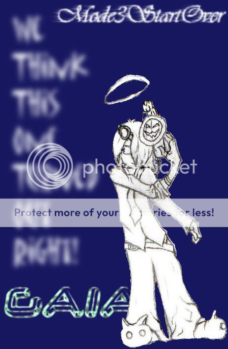
Mode3StartOver midnight_kurai I like how the words are done in the picture. I think the actual artwork kind of sticks out though.
I think it's because the color and quality of the image is totally different from the background. Maybe if you outlined the drawing in pen and drew it on printer paper, it would work. If you want to color/shade it in, use a color like red because that's the color of the background.
Hope it's not too harsh... No no, Not at all dearest. We put in the lined paper because that's all we had in class. We left it like that so it would pop from the background. If everything blended, no one would look. -Mode
Oh I see. Well then it acheives its purpose! =] |
|
|
|
|
|
 |
|
|
|
|
|
|
|
|
|
|
|
|
|
|
Posted: Wed Feb 20, 2008 10:59 am
|
|
|
|
midnight_kurai Mode3StartOver midnight_kurai I like how the words are done in the picture. I think the actual artwork kind of sticks out though.
I think it's because the color and quality of the image is totally different from the background. Maybe if you outlined the drawing in pen and drew it on printer paper, it would work. If you want to color/shade it in, use a color like red because that's the color of the background.
Hope it's not too harsh... No no, Not at all dearest. We put in the lined paper because that's all we had in class. We left it like that so it would pop from the background. If everything blended, no one would look. -ModeOh I see. Well then it acheives its purpose! =] |
 |
|
|
|
|
|
|
|
|
|
|
|
|
|
|
|
|
|
|
|
|
|
|
|
|
|
|
|
|
|
|
Posted: Thu Feb 21, 2008 7:48 pm
|
|
|
|
|
|
|
|
|
|
|
|
|
Posted: Thu Feb 21, 2008 9:07 pm
|
|
|
|
|
|
|
|
|
|
|
|
|
|
|
|
|
|
|
|
|
|
|
|
|
|
|
|
|