|
|
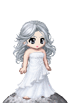
| 1 being the lowest, 5 being the highest : what would you rate this pic? |
| 1 |
|
4% |
[ 1 ] |
| 2 |
|
9% |
[ 2 ] |
| 3 |
|
36% |
[ 8 ] |
| 4 |
|
40% |
[ 9 ] |
| 5 |
|
9% |
[ 2 ] |
|
| Total Votes : 22 |
|
|
|
|
|
|
|
|
|
|
|
|
|
|
|
|
|
 Posted: Tue Jun 26, 2007 7:18 pm Posted: Tue Jun 26, 2007 7:18 pm
|
|
|
|
|
|
|
|
|
|
|
|
|
Posted: Thu Jun 28, 2007 3:34 am
|
|
|
|
|
|
|
|
|
|
|
Posted: Fri Jul 27, 2007 3:15 pm
|
|
|
|
|
|
|
|
|
|
|
|
|
Posted: Sat Jul 28, 2007 9:32 pm
 |
|
|
 |
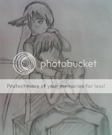
I suppose that I'll be the one that goes and proves "Grieving kittie" right. I have some suggestions. Mind you, they are merely suggestions.
The main things I might suggest altering a bit are the head shapes, the size of the hands, and the direction of shading. First, the shadows go in different directions and, assuming you are seeking the effect of a consistent light-source, this should not be. Next, hands are always a trick and I have had a lot of similar problems with hand size. Balancing fairy-hand and bear-claw is tough, but, especially for male characters, the hands tend to be larger, thicker, and altogether more brutish, really. As for the head shapes, they seem a tad too round, in my opinion. This could be the result of one of two (many, actually) things: The faces are to broad or there is not enough distinction of the jaw line. Now, these are both artistic choices and stylistic matters, but if I am correct in the assumption that you're aiming for realism, then altering these details will help you towards your goal.
I hope that I was of some help to you, this being the 'Legion of Helpers,' after all.
Well, good luck and continue to draw in whichever way you find most suitable!
b
|
|
|
|
|
|
 |
|
|
|
|
|
|
|
|
|
|
|
|
|
|
Posted: Mon May 25, 2009 1:49 pm
|
|
|
|
|
|
|
|
|
|
|
|
|
Posted: Mon May 25, 2009 7:58 pm
|
|
|
|
|
|
|
|
|
|
|
|
|