- by ArakawaMusic |
- Painting And Drawing
- | Submitted on 01/16/2009 |
- Skip
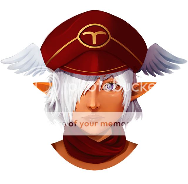
- Title: Concept Character [M1] v2
- Artist: ArakawaMusic
- Description: A refined version of my previous [M1] sketch.
- Date: 01/16/2009
- Tags: concept character
- Report Post
Comments (7 Comments)
- pirate_penguin - 01/15/2010
-
Good shading
Only problem is the fact that your clothing has no movement to them since they dont have any wrinkles in them so it makes the character look like a shaded in rectangle with legs. Bring the nose down a bit as well but love the eyes
Hair should have more flow to it as well(try waving it towards the right considering the wind is blowing your scarf in that direction) - Report As Spam
- Josaa -Hope- - 05/04/2009
-
That is a really good drawing...I highly suggest you Photoshop it and darken the lanes, maybe add some color, etc.
But bravo! - Report As Spam
- xMommycookieSx - 04/13/2009
- omg awesome even though he's not like a bubbly picture the atmoshphere is so serious but i think he's so cute
- Report As Spam
- Panda Guts - 01/18/2009
- nice guns
- Report As Spam
- minixcakez - 01/18/2009
- omg thats soo cute >.< i luv it so cute > 3 <~!
- Report As Spam
- dan___ny-zebra - 01/17/2009
- cool biggrin
- Report As Spam
- Zira361 - 01/16/2009
- *better
- Report As Spam


