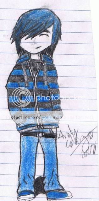
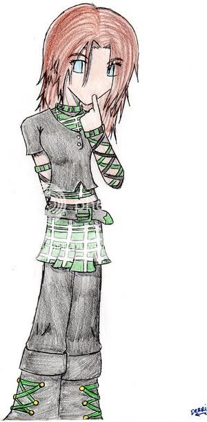
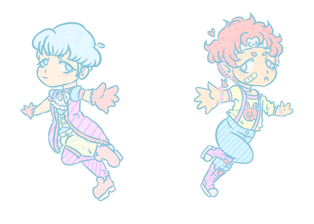
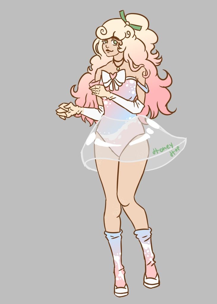
- by CUBIC*fish |
- Painting And Drawing
- | Submitted on 10/17/2003 |
- Skip
- Title: Tony
- Artist: CUBIC*fish
- Description: Character design
- Date: 10/17/2003
- Tags: othersoriginal
- Report Post
Comments (7 Comments)
- Seven Astra - 10/17/2003
- very nice! nice linework and great coloring.
- Report As Spam
- Solrac_Hybrid - 10/17/2003
- Now this IS COOL!!!!! You have it!
- Report As Spam
- Roseflare - 10/17/2003
- O.O soooooooooooooooooooooooooooo cuuuute!!! XD sorry ^^() the cuteness gets to me.. what did u use to color? It looks so cool X3
- Report As Spam
- Muerman - 10/17/2003
- Really exceptional... the blade could use some more pure whites to make it gleam more.
- Report As Spam
- Varnel - 10/17/2003
- And a good character design at that. Excellent use of shading, acessories, and color. Good dynamic pose, too. 8
- Report As Spam
- Marc Seahawk - 10/17/2003
- great work.... check the texture and perspective of the sword... wrong light angle...
- Report As Spam
- Earth Angel - 10/17/2003
- The eyes are funny (Try lashes) and the hand cloests the knuckles are to far back.
- Report As Spam


