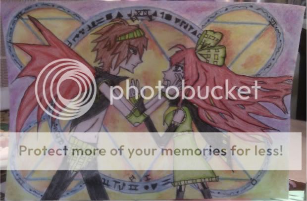
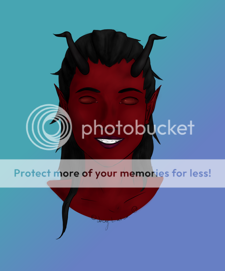
- Title: Eboy Knight
- Artist: Ara Llynn
- Description: I had some fun with this. I only used black prismacolor pencil, and some white prismacolor pencil. I hope you like it. ^_^;
- Date: 10/04/2008
- Tags: eboy knight
- Report Post
Comments (7 Comments)

- Shadoes - 02/13/2014
- Avoid using line strokes. You will get better appeal or realness if you use small circular motion lines. It creates a better effect than the streaky effect a line stroke will give you. Streak lines are better for objects or a subject in motion.
- Report As Spam

- BlackBird_Wakahisa - 01/21/2012
- this is really well drawn. you have just enough shading to show the demensions and the way the character's positioned doesn't look awkward. this is a real masterpeice!
- Report As Spam

- Peddler - 06/29/2011
- all in all though its a really cool character design that looks like it belongs beside a final fantasy title
- Report As Spam
- Peddler - 06/29/2011
- id have to disagree with the previous person, a cross-hatched bakground would kind of take away what catches your eye from the darkest areas, maybe a light crystilographic design that follows the contrary color scheme of black and white, other then that i would leave it the same. I would suggest making your darkests points alot darker and your lightests point alot lighter, it would really make this pop so much more.
- Report As Spam
- Ara Llynn - 01/29/2009
-
I'll have to look more into that. Thanks for the suggestions and comments. ^_^
- Report As Spam

- Lekituzl - 01/14/2009
- It definately does look good the way it does. It doesn't need color! Yano, you should try shading really dark-black for a background. I think it's called cross-hatching. But yeah, great job!
- Report As Spam

- Marta_Box - 01/14/2009
- its very nice demon also DMC ?? greeit
- Report As Spam