- Title: Purple Unicorn
- Artist: Courtles
-
Description:
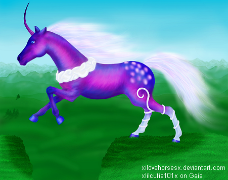
Full size image: http://xilovehorsesx.deviantart.com/art/Aeoliana-104431410
I drew this for a friend of mine on deviantart.
I loved using so many different colors, and doing the hair. :) The hair was a lot of fun.
Ignore the crappy background. I didn't want to take away from the unicorn. ^^;
Used: Gimp
My deviantart: http://xilovehorsesx.deviantart.com/
- Date: 12/11/2008
- Tags: purple unicorn
- Report Post
- Reference Image:
-
Comments (7 Comments)
- Demons Pleasure - 11/14/2009
- ugh.....a unicorn.......disgusting......5/5
- Report As Spam
- Courtles - 06/15/2009
-
Yeah, thanks for pointing out the hoof thing, I didn't really even notice. But it should be bent back more.
Sorry if I sounded snobbish before ^^;
I just get annoyed when I'm critiqued on things that I can't control, like the the design.
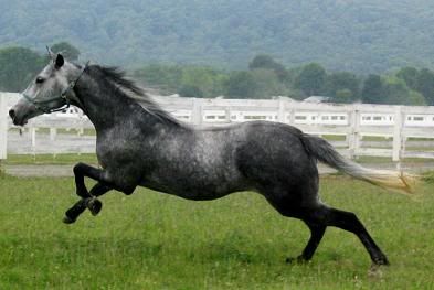
I just didn't put a forelock because the ref horse didn't have one...
Thanks! Haha I like those too smile - Report As Spam
- Faerie s c r i p t - 06/14/2009
-
Yeah, but..the one hoof still needs to be bent correctly.
And without the forelock, the unicorn looks bald. I forgot to put that...>>
You did a very good job, though. I applaud you. 8D I especially like the white vine-y things up the hind legs. x3 - Report As Spam
- Courtles - 06/11/2009
-
First off, the mane and tail aren't made out of hair. It's cloud-like whisps. So no it's not really connected to the horse.
The horn is supposed to be bent like that. This isn't my character and that is how she designed it. The front legs are short because that's the way they are in the photograph. Theire facing away from you slightly so they are foreshortened. - Report As Spam
- apollosgirl95 - 06/10/2009
- the head is waaaaaayyyyyyyyy too big. and both front legs are too short, and the hooves arent shpaed or bent right. and his mane doesnt really look like its part of the body, but all in all, its pretty good.
- Report As Spam
- Faerie s c r i p t - 06/09/2009
-
CONTINUING-
The ears and the horn bother me the most. With the horn bending back like that it makes it look flimbsy as though the wind is pushing it back. The eye looks more akin to a human eye, which looks strange. Over all, it's a very nice piece of work, and I enjoy all the colors. 8D 5/5 for nice work. - Report As Spam


