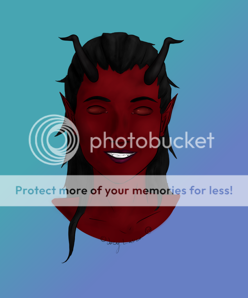
- Title: No Name Man
- Artist: Ukelx42
-
Description:
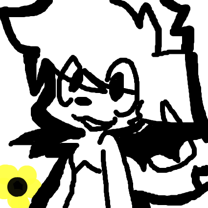
Well... I just kinda want peoples opinions on it...
I know its not the best, but thats the point, I want to know what I could be improved on.
Constructive Crit is welcome.
Drawn & colored in PhotoShop7.0 with a mouse... - Date: 02/12/2009
- Tags: nonameman
- Report Post
Comments (7 Comments)
- XxAkuRoku_EmoxX - 02/17/2009
- I wrote more.. but I forgot what it was.. o.o....
- Report As Spam
- XxAkuRoku_EmoxX - 02/17/2009
-
tad bit more porportional or smaller...
The nostirls look like they're flared..
Like like like... a bull XD
Rawr!
I are a bull.
And I shall eat yer soul >:]
Anyway,
It's simply amazing with what you can do with a mouse and PhotoShop.
Even you know, darling, I can't even write my own name on MSN.. lol
Anywayyyy,
4/5, love!
Great job <3 - Report As Spam
- XxAkuRoku_EmoxX - 02/17/2009
-
You need a little space for the forehead.
It shouldn't be like a Rieanna forehead. (She has a big forehead, o.o..)
Or like, a tiny forehead.
But look at your own forehead, and like see how much you should leave as a forehead, babes.
Just like scoot it down a little.
And, The lips are a tad scary..
Maybe you should make 'em smaller..
'Cause most guys have little thin lips..
Hence all the ******** up guys at my school.. xD
Annd, The nose.
Suggestion: Err.. Make it a ta - Report As Spam
- MUNKI3_GIRL - 02/15/2009
- U DREW THIS ON THE COMPUTER WOW THATS GOOD!~!!
- Report As Spam
- shiba inu67 - 02/14/2009
- slightly freaky but nice effort 4/5
- Report As Spam
- colors on the wind - 02/13/2009
-
very good especially for using a mouse!! ^^
- Report As Spam
- squeekafu - 02/12/2009
-
If you scooted the eyes, nose, and mouth lower on the face, it'd look better. more realistic-like.
keep them within proportion of each other, just move them downwards. move the ears a little, too, just not as much as the other features. - Report As Spam


