- by Eli_Darkness |
- Painting And Drawing
- | Submitted on 06/11/2010 |
- Skip
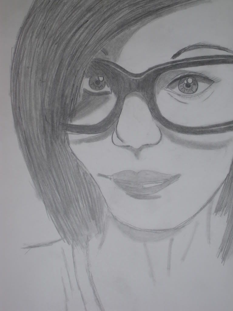

- Title: A friend
- Artist: Eli_Darkness
- Description:
- Date: 06/11/2010
- Tags: friend
- Report Post
Comments (6 Comments)

- motoredwin - 08/06/2010
- nice work how long did it took u to make it
- Report As Spam

- kay_kay_RH - 06/13/2010
- i luv this piece because the detail nd the shading is realy awsome!!!!!!! <3
- Report As Spam

- Phantom-of_Winter - 06/12/2010
-
-continued 2-
that concerns me is the anatomy. The jaw line should not be curved like that (unless that is hair covering that part of her chin). If it isn't hair covering that portion of the chin, I would suggest reshaping the jaw line.
Overall: Your main weakness in this piece are your values. As I had suggested above, blend in the colors more so you have a superb realistic form.
Rating: 3/5; nice anatomical form, needs more work the values and show evidence of a light source. - Report As Spam
- Phantom-of_Winter - 06/12/2010
-
-continued-
shade it in anime; you have a dark color and a lighter color smashed onto each other. Have more variation in it by blending a dark gray so the dark color won't stand out from the lighter color. This way, you can get a great feel of realism. Another thing I would like to point out is how the hair looks too solid and dark. I can't see an evidence of a light source, so maybe if you put some highlights into the strands of hair might expose that specific light source. Another thing that - Report As Spam
- Phantom-of_Winter - 06/12/2010
-
What I like about this picture: I like the expression on the girl's face; a friendly smile with bright eyes. Speaking of eyes, I love how you drew them (to me they look anatomically correct too).
What do I feel needs to be improved: I think you values could be used better. In some places it's too dark and in other places you jumped from a gray to a highlight. You should add more lighter grays and darker blacks to show some realistic value. For example, one of the eyes looks like how you - Report As Spam

- chavinist - 06/11/2010
- o 3o i lurv how the left eye turned out (the one not covered with hair xD)
- Report As Spam