- by FlyingTerra |
- Painting And Drawing
- | Submitted on 03/04/2010 |
- Skip
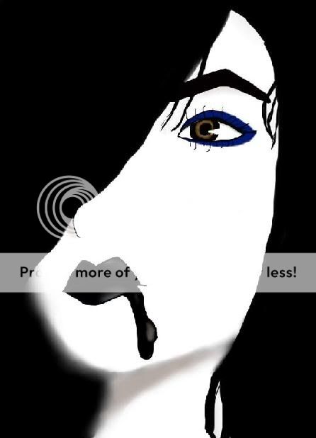
- Title: The light
- Artist: FlyingTerra
-
Description:
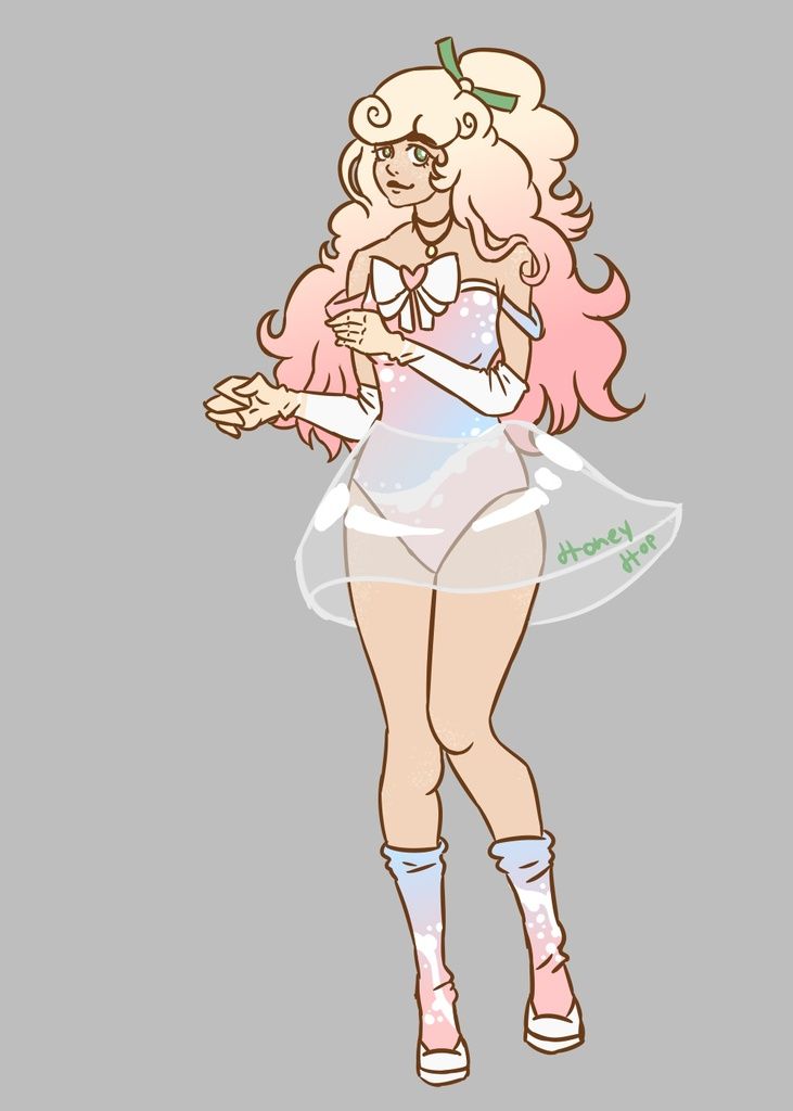
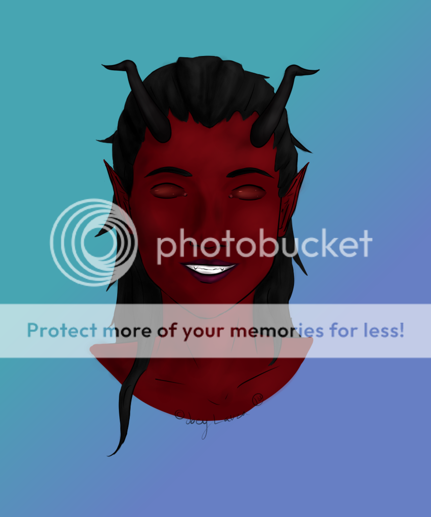
I was bored.
Then I found an old sketch and colored it. (it's not really old.. I drew it only a month ago.. =.=)
I need more practice >.<
-Adobe Photoshop CS4
-Wacom Intuos 4 - Date: 03/04/2010
- Tags: light
- Report Post
Comments (3 Comments)
- Smexorz - 01/31/2011
-
Same as below, to solve the masculinity problem slimming the jaw line would pretty much solve that instantly, like killing two birds with one stone smile if you were feeling brave you could lengthen the face slightly bring the chin and features down a little smile
Its really good though ^^ - Report As Spam
- Esquarria - 03/04/2010
- it is very nice and looks almost as if its animated. As Sohi_Moon said the right side of the face is too wide and the jawline looks too musculine.
- Report As Spam
- sohi_moon - 03/04/2010
- the face on the right side is a little too wide, and the jawline looks too masculine. other tan that its amazing!
- Report As Spam


